Show your ebooks a little love with CSS. Iris Amelia Febres, Director of Solutions Architecture at Aptara and ebookcraft presenter, explains how CSS can help you design better ebooks.
 There’s no doubt the heart of an ebook rests in its content. While we read ebooks because they’re portable, cheaper, and oftentimes enhanced, ultimately, we read them because… well, we like reading. Ebooks are a medium for absorbing content we want to invest in and enjoy.
What you may not know is that when you read an ebook, you’re actually experiencing web technologies in action—more specifically, HTML and CSS. Under the hood of an EPUB (the popular ebook standard by the International Digital Publishing Forum), chapters are coded in HTML: HyperText Markup Language. This applies to all websites (including booknetcanada.ca).
Now, behind that HTML is CSS, or Cascading Style Sheets. To see an example of a CSS document, click here (and save your suggestions for the comments section). CSS is what makes your website—or your ebook—pretty. It’s what gives your ebook personality. It’s what powers design and aesthetic, which in turn, reflects what the content is about and how it feels.
For example, CSS is responsible for how you format:
- dropcaps in the introductory paragraphs of a fantasy novel, which evoke motifs of an illuminated manuscript;
- tables listing ingredients for a favourite childhood recipe, like tomato soup;
- or, text in a narrative that looks like a handwritten journal entry (but is not an embedded image!).
Any ebook can be made without CSS. People have argued that CSS isn’t necessary, and they’re right—you don’t need CSS to have a valid EPUB file. In fact, ereading devices have built-in mechanisms to render styling automatically, or even remove it completely. (I’m looking at you, NOOK, and your Publisher Defaults switch.)
But why wouldn’t you create CSS for your ebook? After all, it’s what gives your book character, that little extra something that sets it apart from so many plain Jane publications (see: Project Gutenberg titles). You need styling, even basic work, in order to establish for your readers:
Branding and tone
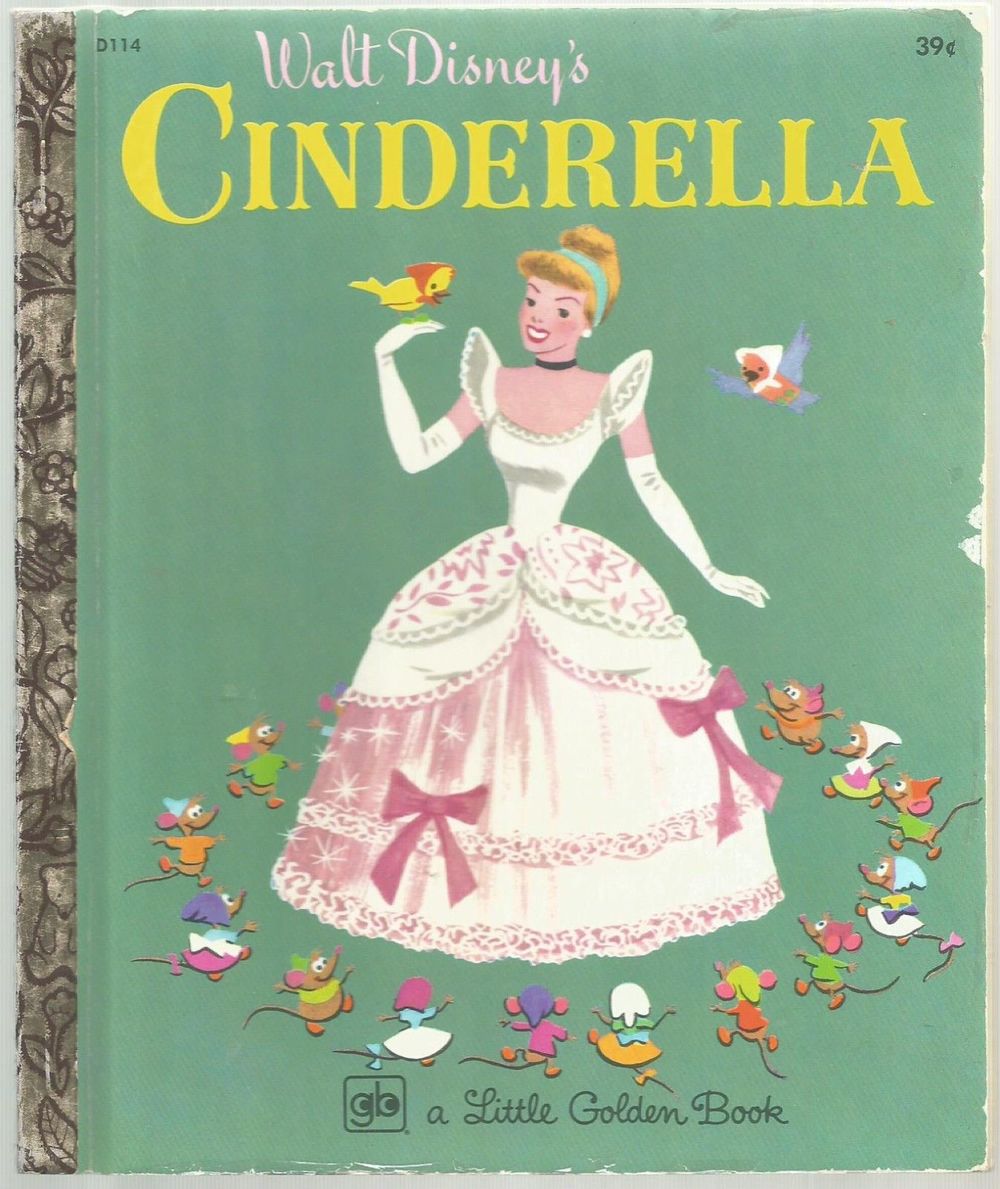 Remember those Little Golden Books? Flat, firm, and stamped with shiny foil? Or how about those Penguin Classics with the bright orange spines? Publishers have opportunities to evoke branding with their design choices: elements like spot colors, initial caps, fonts, paper treatments, and more.
With ebooks, publishers can use CSS to communicate an ebook’s, and a publisher’s, identity. When a book is well branded, a reader will recognize its origins simply from the design. And when you create efficient CSS, utilizing “the cascade”—the magical “C” in CSS—branding is made that much easier. Cascading is the pivotal principle that allows the code to be fluid and powerful, removing redundancy and having you do less work to design a particular element.
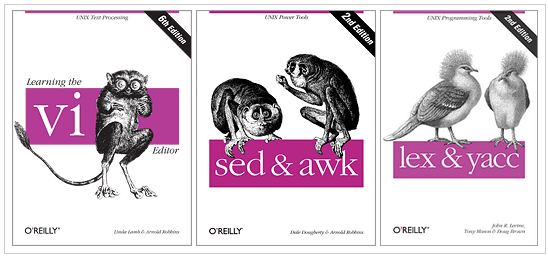
(For great examples of effective ebook branding, check out any digital edition of O’Reilly’s “Animal” books. Their design template is consistent, and you know right away when you’re reading one, even when you mess with reading modes or font sizes.)
Tone also comes into play when you talk about CSS. You can create formality in your ebook through simple code. The theme of a novel and the interplay of its characters can be recognized through the subtle use of a serif or sans-serif font; emphasis in dialogue can be rendered with bold face or italicized text. And let’s not forget colour. These are all potential facets of a book’s tone, which are executed through CSS.
Key CSS rules: font-family:; | font-weight:; | font-style:; | color:;
A relationship with the content
While HTML is responsible for providing structure to an ebook’s content, CSS is responsible for illustrating it. An ebook developer can further determine a content’s hierarchy through the display of headers, captions, and sidebars. For example, it’s common practice to utilize sans-serif fonts for non-linear content, reserving serif fonts for running text. These cues lead the reader through content, conveying what’s important and what can be revisited.
Key CSS rules: font-family:; | font-size:; | text-align:; | float:;
A relationship with the audience
CSS is ultimately what the reader sees right away through rendered design. An ebook’s overall layout will make a reader decide how she feels about a book as she reads it. This is your opportunity to give your content some polish; with CSS, publishers can put thought into spacing, line height, alignments, and other aspects that determine how text falls on a page. This is especially important for reflowable ebooks because they will be accessed on multiple platforms.
CSS must be lean. Your reader may consume ebooks across different devices and screen sizes. At the end of the day, CSS demonstrates that you care about your text, which means you care about your reader.
Key CSS rules: line-height:; | margin:; | padding:; | border:;
Forget judging a book by its cover—I judge it by its CSS. It’s the first thing I notice when it’s stripped away by an ereader application. However, while it’s important to note that the heart of ebook design is carried through by CSS, it also relies heavily on the structure provided by the underlying HTML. You can’t efficiently style an ebook built on poor HTML. Consistency will surely be lost across content, leaving you with a headache. Updating and maintaining CSS without clear and corresponding HTML elements is a developer’s worst nightmare.
So how do you make and keep good CSS?
- Keep it lean. Like any good design, less is more. Remember, your CSS is there to facilitate your content—not overpower it.
- Again: Keep it lean. The cascade is a friend to all developers who love shortcuts (i.e., all of them). For example, when you write your CSS for margins, you don’t need to declare the individual segments on separate lines—margin-top, margin-left, etc. You can truncate your CSS to a margin—0em 1em 2em 3em for top, left, bottom, right, respectively—and save some lines of code. (Which makes for a lighter ebook file. Every bit counts!)
- Use only where needed. CSS shouldn’t be redundant. Again, that’s what the cascade is for. I like to play with Dreamweaver’s Design mode to toggle between changes when I cut down on CSS. Another oldie-but-goodie strategy for finding unneeded CSS: India Amos’ BBEdit magic. I recall a good chunk of the QA work I did as an ebook developer involved removing repetitive CSS from vendors’ ebooks. India’s method saved me hours.
- Test your CSS everywhere. Good developers try to break their own code. For solid QA, try to break your ebook’s CSS. Where does it go wonky? Does your text get weird when you change device orientations? And always ask: Is the design interfering in any way with the content? Can the text stand on its own without added flair?
CSS documents make ebooks beautiful. Most readers don’t see the CSS file, but they recognize the design it engenders. Like anything that’s beautifully crafted, ebooks have the power to leave a lasting impression. Just remember: a little goes a long way. Remember your audience, and they will remember you.
 Want to learn more about CSS and ebook design? Iris will be revealing practical use cases for designing ebooks with CSS at her ebookcraft workshop on March 10 in Toronto. See the full schedule here. Registration closes Feb. 25.
